Technical Writing
Technical? yes. boring? No.
Technical writing, at its best, is a rhetorical expression of empathy and respect, creating and supporting community and productivity.
Helping others take part in an event, activity, or craft is part of creating community, regardless of whether the audience is in-person or online, professional or social. Good technical writing is, at its heart, a tool to promote understanding and remove stressors by providing helpful, appropriate communication.
Less explaining means more doing
These how-to guides for increasing LinkedIn reach and an onboard process map document for the SoFlo Writing Project were created in collaboration with Scribe AI and Canva.
The writer’s skill is in being able to identify the essential steps for your audience while discarding any unnecessary information to streamline future tasks for your coworkers or clients, and editing each step for clarity and precision. Scribe offers code for their products to be embedded as a scrolling document (below left), slides, (below center), or a video (below right).
Professionals deserve professionalism.
Using brand colors and visuals effectively can just make following instructions that bit more straightforward, meaning fewer questions to resolve and a smoother onboarding for participants.

DEsiGned for understanding
“Show, don’t tell.” This journalistic writing advice extends across genres.
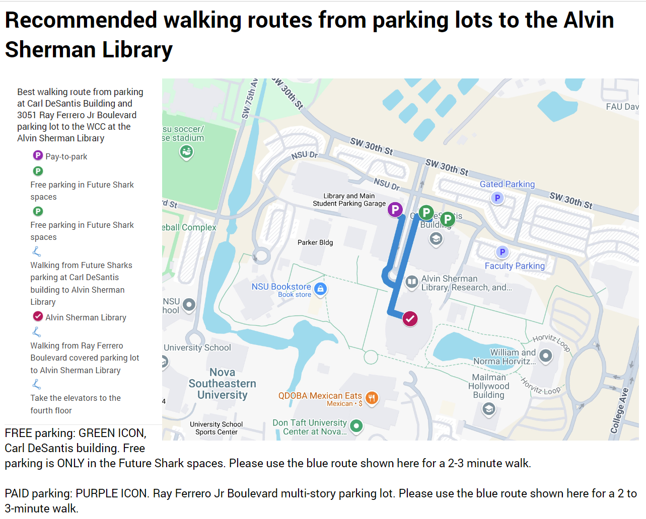
Visualization of data helps connect your audience to a message that could otherwise be obfuscated by numbers and illuminates narratives that may be lost in pages of text, or hidden in a nutritional label. These images and documents were created using Google Maps and Canva.
Just because it’s easy to read doesn’t mean it’s basic.
The infographic below extrapolates data on contributing factors to the high rate of cyclist deaths in Broward County, Florida. I created it by synthesizing substantial amounts of quantitative state, county, and law enforcement information, supporting this with qualitative data from my daily cycle commute.


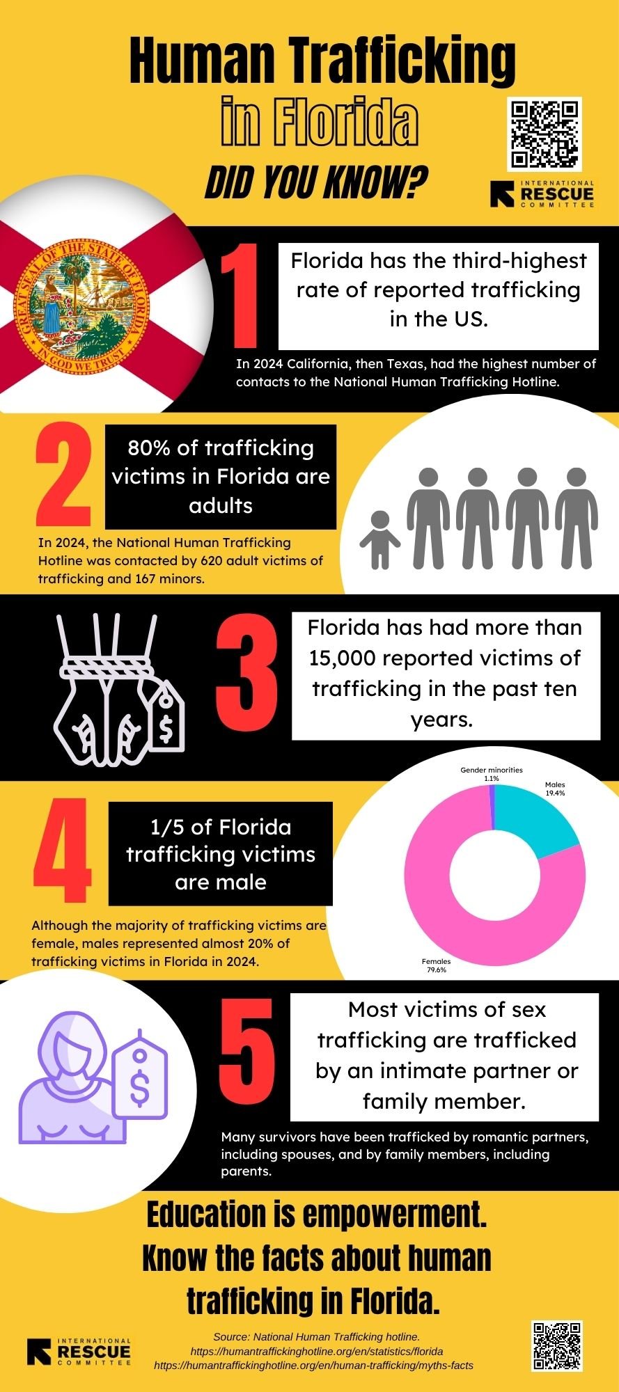
I created this infographic (below) and flyers for the International Rescue Committee’s anti-trafficking team in Miami in response to the need for greater awareness of the scale and types of human trafficking prevalent in Florida. Designed for a general public audience, they can also be adapted for fundraising materials.


A picture, or a thousand words? yes, and yes
These designs were used to illustrate my seminar paper on the detrimental impact of standardized testing on student thinking and writing. Supporting the text with research-based images distilled hours of research in an impactful at-a-glance graph that clearly demonstrates the desperate need for a change in how we teach writing in K-12 public schools in Florida.


“Show, don’t tell.” This journalistic writing advice extends across genres.
Visualization of data helps connect your audience to a message that could otherwise be obfuscated by numbers and illuminates narratives that may be lost in pages of text, or hidden in a nutritional label. These images and documents were created using Google Maps and Canva.
Map-making as a rhetoric of welcome
University campuses can be bewildering for visitors. Giving newcomers the knowledge of not only where to park but also what kind of parking is available, whether free or paid, covered or uncovered, helps promote a sense of welcome and courtesy to event attendees before they even set foot in the location.